Design Update: A New Concept and the Original Direction
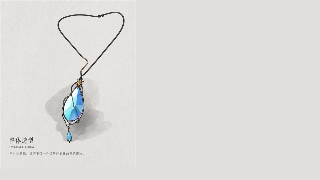
The pendant first belonged to Saya and was given to Viss on his twelfth birthday. It gives him no power. It reminds him that he was loved, and that there is somewhere he can go back to.
The new concept moves away from a polished, perfectly regular look. It keeps the cool-blue stone, the warm gold star, the orbit lines around the stone and the teardrop, but uses a more asymmetrical stone, a lighter metal frame and a plain black cord.
The original design is symmetrical and slender — complete, ceremonial, and closer to what backers saw on the campaign page. Its ideas of embrace, guidance and home are still what we want to keep.
The new concept feels freer, like a relic someone actually used; the original is more complete and more recognisable as a product. We are not simply swapping one for the other, and will keep comparing how each works for the character, the structure and the wearer.
Our poll “Which direction do you prefer?” drew 14 votes: 7 for the new concept, 7 for the original.
All images are concept art and style studies. Final materials, size and structure depend on sampling.